How to Format a Blog Post: A Writer's Reference

This is a reference for writing blog posts, not an announcement. It shows every way you can format a post, with the text you type on one side and how it looks on the other. When you're writing and you think "how do I add a quote here?" or "how do I make a list?", come back to this page, find the example, and copy it.
You write posts in plain text with a few simple marks — a couple of stars for bold, a dash for a bullet, and so on. You don't need to know any code. If a style isn't shown on this page, it isn't supported yet — check with the team before using it.
The info box at the top
Every post begins with a small block of details between two lines of dashes. Think of it as the post's label — it sets the title, the summary, who wrote it, and the cover image. Fill in each field and leave the dashes alone:
---
title: "Your post title"
description: "A one or two sentence summary. Shown on the blog listing and in search results."
createDate: 2026-06-29
author: vik # the writer's short name
topic: product # the category this post belongs to
cover: "./assets/your-cover.png" # the image shown at the top and on the listing
relatedBlogs: ["april-updates"] # optional — up to 3 post slugs to feature below the post
---
A few things to know:
- The summary should be a short sentence or two — long enough to be useful, short enough to fit on a card.
- author and topic must match names that already exist. If you're a new writer or need a new topic, ask the team to set it up first.
- Put your cover image and any other images in the post's
assetsfolder, then point to them like./assets/filename.png. - relatedBlogs is optional. List up to 3 other post slugs (the post's filename without
.mdoc) and they'll show up as a "Related articles" section at the end of this post — pick posts that genuinely help the reader go deeper, not just the newest ones.
Headings
Headings break your post into sections. Use ## for a main section and add more # signs for sub-sections under it. Don't use a single # — the post title at the very top is already the biggest heading, and your sections should sit underneath it.
This is a main section (##)
A sub-section under it (###)
A smaller heading (####)
## This is a main section
### A sub-section under it
#### A smaller heading
Most posts only need ## and ###. Reach for the smaller ones only when a section genuinely has layers.
Paragraphs and styling your words
A paragraph is just a block of text. Leave a blank line between paragraphs and they'll be spaced correctly — don't worry about the spacing yourself.
Inside a sentence you can make words bold, italic, or both. You can link to another page and cross out something that no longer applies. These combine freely, so you can have a bold link when you need one.
Make words **bold**, _italic_, or **_both_**.
Link to [another page](https://wauld.com) and cross out ~~old text~~.
Use bold to make a key phrase stand out, italics for a lighter emphasis or a title, and links generously — they help readers and search engines alike.
Lists
Use lists to break related points out of a paragraph so they're easier to scan.
For bullet points, start each line with a dash:
- A first point
- A second point that can run as long as you like — it'll wrap neatly on its own
- A third point
- And a sub-point, if you indent it
- Like this one
For a numbered list — steps, rankings, anything with an order — start each line with a number:
- Do the first thing
- Then the second thing
- And finally the third
- A first point
- A second point
  - A sub-point, if you indent it

1. Do the first thing
2. Then the second thing
You can also add a full paragraph inside a numbered step — just indent it to line up under the text:
First, do the obvious thing.
Then add a sentence or two that explains the step in more detail, lined up under the words above.
Move on to the next step.
A card-style numbered list
For steps, reasons, or limitations that deserve more visual weight than a plain numbered list, wrap the same kind of list in a {% numbered-list %} tag. Each step becomes a bordered card with a numbered circle instead of a plain digit:
- 1
Hard feature cliff between tiers
Some features require a conversation with sales — no self-serve mid-tier exists.
- 2
No analytics on the free plan
Zero visibility into how recipients engage with what you send them.
{% numbered-list %}
1. **First reason**

   A sentence or two explaining it.

2. **Second reason**

   Another sentence explaining it.
{% /numbered-list %}
The bold first line becomes the card's title; anything indented underneath it is the description. The numbering is automatic — just keep using 1., 2., and so on as you would for a plain list.
A feature grid
To highlight a set of short capabilities — the kind of list that reads best after an option summary — wrap a plain unordered list in a {% feature-grid %} tag. Each item becomes a green, checkmarked chip laid out in a two-column grid (it collapses to one column on narrow screens):
- Real-time analytics on the free plan
- 1,000+ handcrafted templates
- AI-assisted design tools
- Zapier & webhook automation
- 300 credentials/year free
- Self-serve growth from $39/month
{% feature-grid %}
- Real-time analytics on the free plan
- 1,000+ handcrafted templates
- AI-assisted design tools
- Zapier & webhook automation
{% /feature-grid %}
Keep each item to a short phrase — chips are sized for a single line, not a sentence with a description.
Quotes and callouts
A quote stands out with a colored bar down the side. They're great for a pull quote, an aside, or a "what's next" note at the end of a post. A quote can hold its own little heading and more than one paragraph — start each line with >:
A heading inside a quote
Quotes can hold several sentences and still use bold or italic words. Use them for callouts and highlights rather than for every quotation.
> #### A heading inside a quote
>
> Quotes can hold several sentences and still use **bold** words.
A callout is a boxed aside with its own icon and title, for tips and notices that should stand out even more than a quote. Write it as a tag wrapping your content:
{% callout title="Heads up" icon="Megaphone.svg" %}
Callouts render their content normally — **bold**, lists, and more all work.
{% /callout %}
You can also use callouts to recommend related reading:
{% callout title="Related reading" icon="📖" %}
See [Your related blog post](./post-slug.mdoc) for more on this topic.
{% /callout %}
The icon can be:
- the name of a file from the shared icon set, like
icon="Megaphone.svg"— ask the team if you need a new one added - an emoji, like
icon="💡" - a full image address starting with
/orhttps://
Both title and icon are optional — leave either off if you just want a plain boxed aside.
Call-to-action banner
When a post should end with a pitch — "now try this yourself" — wrap it in a {% cta-banner %} tag instead of writing it as plain text. It renders a banner with a heading on the left and a button on the right, and every part already has a sensible default, so you can drop it in with no attributes at all:
Ready to issue your first credential?
Design, issue, and verify certificates and badges in minutes — free for up to 300 credentials, no credit card required.
{% cta-banner /%}Override any part you like — eyebrow, title, subtitle, buttonText, and buttonHref are plain strings, and theme switches between a light surface and a dark one:
Ready to try Wauld?
Issue your first credential in minutes.
{% cta-banner
   theme="dark"
   eyebrow="Limited time"
   title="Ready to try Wauld?"
   subtitle="Issue your first credential in minutes."
   buttonText="Get started"
   buttonHref="/user/signup" /%}
All six attributes are optional — set only the ones you want to change and leave the rest to fall back to their defaults.
Images
To add an image, drop the file into the post's assets folder and write a line like the one below. The alt text is the description — write something meaningful, because it's read aloud to people using screen readers and shown if the image ever fails to load:
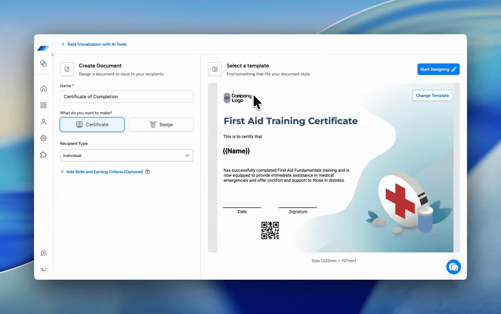
{% image src="./assets/skills-demo.avif" alt="A short description of the image" /%}Images automatically size themselves to the post, so you don't need to worry about dimensions — just use a good-quality file.
Captions
Add a title to show a caption underneath the image:
{% image
   src="./assets/skills-demo.avif"
   alt="A short description of the image"
   title="The caption shown under the image" /%}
Video
Adding a video works almost exactly like adding an image, but with the {% video %} tag. Hand your clip to the team to add, then point to it with a /videos/... path. By default a video plays on its own, silently, on a loop — perfect for a short product demo or anything you'd previously have used a GIF for:
{% video src="/videos/sample-clip.mp4" alt="A short looping brand clip" /%}When you'd rather give readers a real player — with a play button and sound, that waits for them to press play — turn on the controls:
{% video
   src="/videos/sample-clip.mp4"
   alt="The same clip with player controls"
   controls=true autoplay=false loop=false muted=false /%}
Use the silent looping version for short, glanceable clips, and the player version when the video has narration or sound, or runs long enough that readers should choose when to watch. Videos take a title caption too, exactly like images.
Tables
Use a table when your information is genuinely a grid — columns and rows. Separate each column with a |, and add a line of dashes under the header row. The colons in that dashed line set how each column lines up: :--- left, :---: centered, ---: right.
| Style | What you type | What it looks like |
|---|---|---|
| Bold | **text** | text |
| Italic | _text_ | text |
| Link | [label](…) | label |
| Style | What you type | What it looks like |
| :---- | :------------ | -----------------: |
| Bold  | `**text**`    |           **text** |
| Link  | `[label](…)`  |          a link    |
You can still use bold, italic, and links inside a cell. Keep tables for short, tabular facts — longer explanations belong in ordinary paragraphs.
Dividers
Three dashes on their own line draw a horizontal divider. Use it to mark a clear break between major parts of a long post — sparingly, so it stays meaningful.
---Putting it together
Most posts only need a few of these: headings to break up the sections, paragraphs and the odd list for the body, an image or two, and maybe a quote at the end. The tables and video players are here for the times you need them.
A good rhythm to write in:
- Open with a short paragraph that tells the reader what the post is about.
- Break the body into
##sections with clear headings. - Add an image or clip wherever it helps a reader picture what you mean.
- Close with a quote or a short "what's next" note.
When in doubt
If you can't find a way to format something on this page, it's probably not supported yet. Ask the team rather than guessing — and we'll add the example here so the next writer has it too.